Monday, June 30, 2014
Sunday, June 29, 2014
EXP3 Final Image captures/Animation Walk-through/Lumion File link
5 Final Image Captures:
Animation Part 2:
Lumion File Link:
https://www.dropbox.com/sh/7yqpscpptecu9dv/AADKBwkf77fOBXSVVkXyis5Wa
The bridge mainly uses the colour white, because the colour ‘white’
has connotations to purity and elegance yet simple which suit my ‘theory’. Also,
the bridge is not overloaded with objects, while maintaining consistent
throughout because my ‘theory’ also stated “Removing all the clutter…and the
messiness, and the inconsistency, and the imbalance, just to reveal an
underlying structure, and an order… and a calm centered piece. So keeping
everything in its most simple and purest form is one of the key factors in my ‘theory’.
In my design of the bridge I have included a lot of tall
windows which occupy the whole height of the floor because in the ‘theory’ I created
with my mash-up, daylight is a highly cost effective means of reducing energy
for electrical lighting, and by using large windows the bridge will be able to
get more sunlight in the interior of the bridge.
The Folly is simple because according to my ‘theory’ “reducing
everything down to the purest, most elegant form…” so even though the Folly is
simple it can convey a sense of purity and elegant instead of looking bulky and
‘a lot of things happening at the same time’.
Animation Part 1:
Animation Part 2:
Lumion File Link:
https://www.dropbox.com/sh/7yqpscpptecu9dv/AADKBwkf77fOBXSVVkXyis5Wa
Saturday, June 28, 2014
EXP3 Developed and Drafts of Lumion Environment/Draft of model
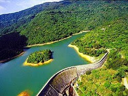
The Lumion Environment is based off of the Tai Lam Chung Reservoir in Hong Kong.
Initial Environment:
Developing Environment:
Developed Environment:
Draft Model:
Tuesday, May 6, 2014
Final image captures with texture
From the image above we are able to see the simplicity of the two
monuments and also the land between the two is smooth to further convey the
simplicity between the two monuments, but with the aspect of shadows the simple
objects convey different complex levels of feelings when different time shadows
are cast onto the curvilinear object.
Shadow is an important factor within my two monuments
because shadow is used to link the two monuments together. From the image above, as the rectilinear monument
projects its shadows onto the curvilinear monument in different times it
conveys different feelings.
The textures on both of the monuments are quite smooth, also
the path between the monuments are a smooth path without any sudden lumps, and
with the addition of the pond it evokes a sense of soothing sensation because
water calms you down, which makes the path in between the two monuments smooth.
Wednesday, April 30, 2014
Textures and concepts
My concepts based on Alisa Andrasek is from her Facade India for Biothing
Simplicity – By joining simplicity together it becomes complexity.
Section – By joining different sections up there will be an
unlimited possibility of shapes that can be produced.
Thin – Thin surfaces gives off a light and minimal
appearance evoking a light and soft atmosphere.
Delicate – With the delicate appearance of the building it
gives off a sense of fragility while being sturdy.
Progressive – As the building progresses from the edge
inwards to the building there is a transition of hollow to a more solid
feeling.
My concepts based on Frei Otto is from his German Pavilion
Minimal – Thin surfaced with minimal support to generate a
light and weightless appearance.
Smooth – Smooth surfaces to generate a flow throughout the
whole building making it appealing for the eye.
Planar – A flat surface that generates minimalism, also
maintains its role of providing shelter.
Irregular – Irregular shapes convey a sense of suddenness to
evoke a feeling of freshness and an element of surprise.
Subscribe to:
Comments (Atom)


+Alisa+Andrasek.jpg)


